ICONS - CAN THEY BE FUN AGAIN?
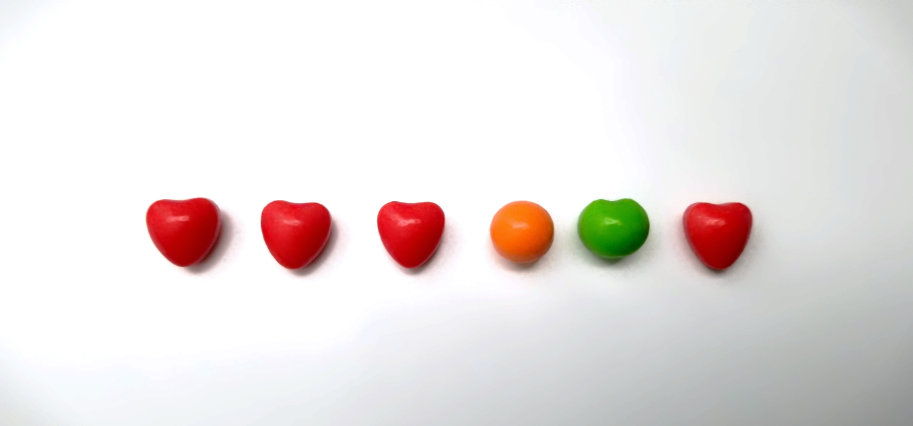
Someone I follow on social media posted something that reminded them of runts candies. Remember those from when you were younger? Recall the mixed reviews on the little banana-shaped ones?

I decided to see if I could pick up a pack on amazon (because #amazonHasEverything) and well, of course I could. So here I am looking at a small pile of runts and having this whole “what came first, the chicken or the egg?” moment.
The little heart-shapes, which I believe are supposed to be cherries, remind me of 1980s-1990s video game “extra life” icons. The orange and green ones remind me of “presence state” availability icons inside chat tools.
This leads me to the topic at hand.
Are all icons based on candy?
just kidding
Can icons get fun again?


Well - from a design, usability and experience perspective, here are a few considerations:
Color is fun, but themes matter
I think it is OK to theme icons in creative ways, but you have to be sure the color scheme matches the rest of the context. This is probably the biggest reason for the minimalist near-over-simplification of colors in iconography today. You don’t want the interface to clash with the content within the tool and context. You want it to stand-out as a tool, but not collide.
Color provides context
Color itself has near-universal meaning today. Blue typically means “click me” or “active” or “available.” Green means “good.” Red meanings “recording” or “warning” (remember, context matters.) So embedding color in an icon can be tricky unless you can naturally limit context that doesn’t need to change too often or convey too much contextual state meaning.
Form should be intuitive, and at the least memorable
While you are busy having fun cranking out creative icons, you really want the audience to quickly understand their purpose. This is not always the case, however. Some audiences will endure a learning period where you slow-walk them into your iconography over time, which allows you to sacrifice some intuitiveness in trade for creative expression, as long as there is a low bar for being considered memorable. If the icon is complex or too much like some other well known icon, or another creative icon you just created, then you are probably asking people to work to hard.
So can icons incorporate more creative color? Probably, in the right context, if you don’t sacrifice ease of communication and make your audience work too hard. But in the right context, and done well, it really could set you apart.